It's the middle of the scorching desert and you've crash landed your one ticket home into the north side of a pile of sand the size of Mt. Rainer. Don't worry too much though because beside you just happens to be the worlds most remote (and unnecessary) construction of wood and steel in the form of a water tower. Things have been going great, the tower provides shade and water in the unbearable heat of the morning, noon and night. A small spigot at the bottom of the tower easily twists to the right to reveal a seemingly endless flow of liquid gold. For whatever reason this tower was built it can surely be said that you are one lucky fuck. So, minus the food aspect, you've basically got it made.
Too bad a band of marauders equipped with AK-47's and knives duly unsuitable for cooking just stumbled on you an your towering oasis. Short of slicing your head of with a machete or pulling your toe nails off one by one with pliers the band of desert delinquents has left you alone. Sure they robbed you of every inch of semi-worthy material and shot holes in your spring, but hey, at least you aren't dead.
Before you, in the wake of the mugging, lies the key to your survival slowly spewing out its contents into the absorbent orange and red sand. 'Yikes' you think, maybe I should try and stop the water from leaking out. Maybe delusional from the stunning heat, possible vexed by the assault just sapped upon you or even conceivably because you haven't had so much as a lizard to eat in the past week you decide to simply watch the water drain out the holes and fall to the ground.
Gravity is a wonderful thing.
Monday, May 16, 2011
Saturday, May 14, 2011
Wednesday, May 11, 2011
Tuesday, May 10, 2011
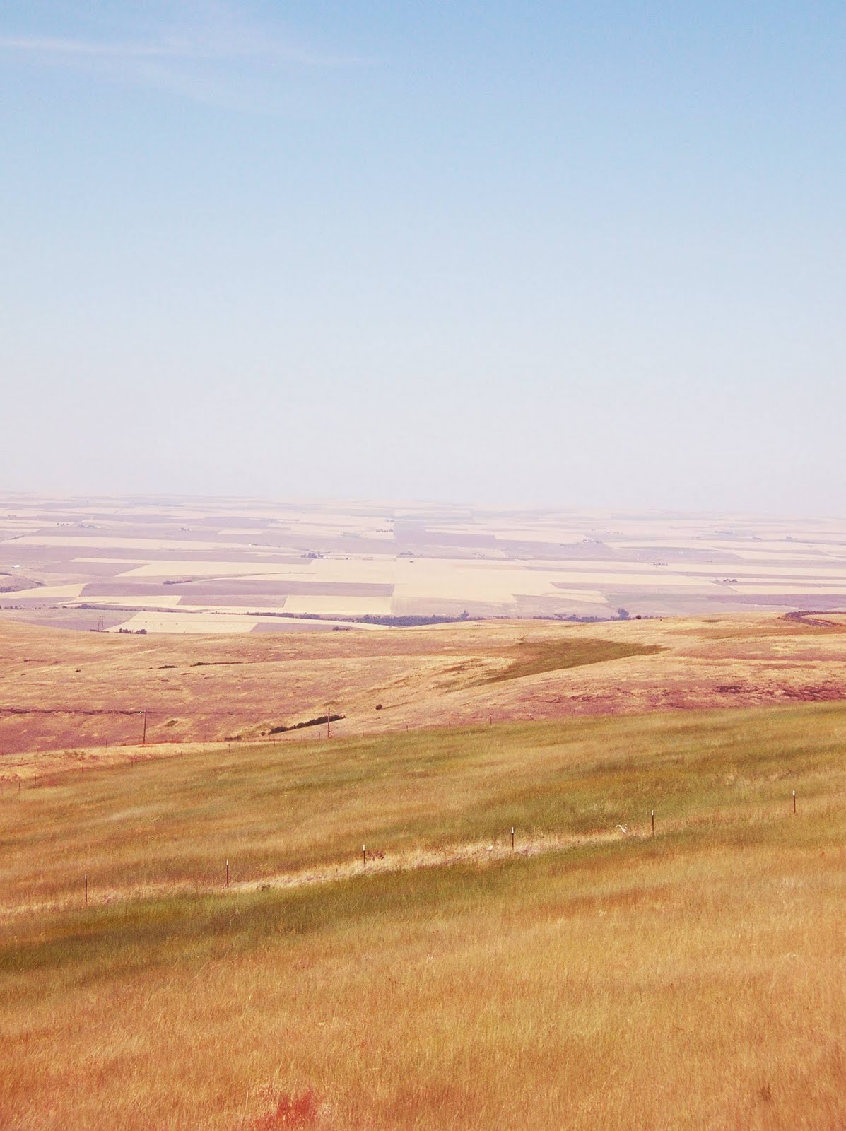
Random Photography - Eastern Washington
Sorry about the horrible photoshop job, I wanted to spruce up the pictures. Didn't turn out so well. . .
End of the Year Book Photos!
The final project for my year at cornish was to create a 14 page book inspired by a site of our choice. I decided to go to the OSP (Olympic Sculpture Park) and do some blind contour drawings. Below are the photos from that book, unfortunately the photos turned out a little blurry but i don't have time to take new ones. I will be selling this book to Ruthy tomorrow, I hope it enjoys its new owner - take care of it Ruthy.
Labels:
Art,
Book,
Cornish,
End of year,
Final,
Olympic,
Park,
Ruthy,
Sculpture,
Watercolor
Wednesday, May 4, 2011
100 Interests - Connections Artwork
After creating another list of 100 things I was interested in our foundations class was asked to create a piece of art that connected the list we made at the beginning of the year with the one we created last week. I decided to make a word hunt of sorts. Check it out.
Labels:
100 Things,
Art,
Foundations,
Hunt,
List,
Word
Pocket Shrine 2.0
Here is my pocket shrine from the end of the year. Check back in my blog history to see the original shrine from September.
Monday, May 2, 2011
Wednesday Night: Sutton-Beres-Culler
Sutton-Beres-Culler, I sculpture trio (minus one) that visited us last wednesday night shared their sculptural works and discussed what it takes to make effective three dimensional objects. Site played a huge role in nearly all of the pieces they presented to us. It seemed as though most of their works were somewhat comical and almost satirical in nature. From the drive through gallery to the park bench and even the asian restaurant inside a gallery, the site they choose and what goes it in usually seems to reflect a place where the decided object would not usually be. Limited not only to comedy, Sutton-beres-Culler also utilized site in a more utilitarian way in means of beautifying the urban landscapes around Seattle. Chalk friendly sidewalks, trolly car man-hole covers and even renovated gas stations, it appeared that the group also cared deeply for the community they create in and what they can do to make it a better, more artistic space to live in. The main thing I think I will take from all of this is that site is much more important than I had once thought it was. It can be used as comic relief, or even a serious means of telling a story about a place or time. I'm not sure how this will exactly tie into my upcoming projects but I believe it has weighed heavily in my brain. I hope to take advantage of its intricacies in my artwork sometime in the future.
Saturday, April 30, 2011
Final Pictures - Freshman Independent Project Gallery
Here are the final shots of my paintings for the 2011 Freshman Foundations Independent Project Gallery show (a mouth full, I know).
Monday, April 25, 2011
Jeremy Mangan Wednesday Night
Picture for yourself a beautiful landscape that looks eternally familiar and distinguishable yet holds no place in reality. Flowing fields of golden and green framed by rugged mountains of snow and rock. In the foreground the wood and plastic and paint of a modern day homestead suspended in air breaking the bounds of physics. A person-less world, surreal and dreamy, yet tangible to a surprising extent. These are the paintings of Jeremy Mangan, our guest peaking for wednesday night. His oil and acrylic paintings show a open ended narrative, places where the viewer is left to embark on their own story while basking in the often times photorealistic lands he paints. Picture a raging torrent of ocean swell, picture a tent city with not a single person present, picture a barn the size of a towering skyscraper, and once more picture a land based in reality but so far from the true nature of our universe. As if he slipped and fell into another dimension Mangan's paintings are the culmination of devotion, hard work and an imagination of the highest capacity. He a cool guy, so check out more of his work! Jeremymangan.com
Tuesday, April 19, 2011
Monday, April 18, 2011
Independant Project Plackard Thing
The two paintings you have more than likely already viewed are titled (from left to right) painting #1 and painting #2. They show in majestic oily beauty the natural scenes of the Pacific Northwest . . . with a twist. Commenting on the encroachment of urban development and increasing threat of deforestation, this pair of paintings aims to make you smile, laugh and maybe even ponder the future of the forests around us. Composed from 18x24 stretch canvas and mounted on a wall, I proudly present my dedicated works of paint for the 2011 Foundations Independent project. Enjoy.
Wednesday Night Critique
This past Wednesday night our foundations classes met up with upperclassmen to discuss and critique the independent projects we are working on. My group, along with fellow foundations students, gathered with a sophomore named Sarah - a painting and (sculpture) student. We were asked to have prepared two questions for our assigned student, below are my questions and the responses I gleaned.
1.) As a painting student (to Sarah) what general advice do you have on how to make my painting better?
Sarah responded that the panting overall looked very well done and that she particularly liked the style I was painting in and that it looked rather impressionist and abstract, something she really valued. She continued to give me advice on atmospheric perspective suggesting that the further things are away the more blurry and less defined they look. She proposed that for objects in the backgrounds of my paintings I go back in with a dry brush and sort of blur them out a little, thus giving them the illusion of more depth and distance away from the foreground.
2.) Initially I had the word 'sold' in the foreground of my waterfall painting, I took it out because it cluttered up the image, what thoughts do you have on leaving the words out and does the red rectangle communicate well enough the idea that the image in question has been sold?
Unanimously from not only Sarah but the other students in my group I got the response that the red rectangle was more than enough and that it communicated the idea more that sufficiently. They mentioned that since they couldn't see the words in they couldn't say for sure that they though the current version was better but that they believed it was fine as is. They all got the message the painting was trying to communicate: that the waterfall was being sold.
1.) As a painting student (to Sarah) what general advice do you have on how to make my painting better?
Sarah responded that the panting overall looked very well done and that she particularly liked the style I was painting in and that it looked rather impressionist and abstract, something she really valued. She continued to give me advice on atmospheric perspective suggesting that the further things are away the more blurry and less defined they look. She proposed that for objects in the backgrounds of my paintings I go back in with a dry brush and sort of blur them out a little, thus giving them the illusion of more depth and distance away from the foreground.
2.) Initially I had the word 'sold' in the foreground of my waterfall painting, I took it out because it cluttered up the image, what thoughts do you have on leaving the words out and does the red rectangle communicate well enough the idea that the image in question has been sold?
Unanimously from not only Sarah but the other students in my group I got the response that the red rectangle was more than enough and that it communicated the idea more that sufficiently. They mentioned that since they couldn't see the words in they couldn't say for sure that they though the current version was better but that they believed it was fine as is. They all got the message the painting was trying to communicate: that the waterfall was being sold.
Subscribe to:
Posts (Atom)